Not sure I enjoy it. It's aesthetically pleasing at first, but then it just annoys me.
All maps have problems with representing distance and space in a 2D form, but this become a little absurd. As an artistic experiment I'd give him a pass except he explicitly said:
"Let's get the geography as well because, with maps, shapes and geography are important. Let's try to make my map better than TfL in every way".
He then absolutely butchers the geography in terms of relative or absolute position, changes the shape of the Thames in weird and unfamiliar ways and makes it hard to reason about distances in many cases (Note: don't try and walk from Richmond to East Putney, as it's a lot further than it looks on that map: about half the distance (4.9mi) from Richmond to Farringdon (10.3mi).
I understand why maps get redesigned into different forms, and generally I love it if you're communicating a new idea about distance, space, or some other data point. But I don't really get what the idea behind this is other than "circles".
This is the thing people forget about maps - any map is a falsehood, because it's not the thing mapped. It has a purpose and will bend various things to best serve that purpose. A subway map is NOT a walking map; it's (usually) a guide to the transit system and how to get from station to station.
In London lots of platform signs are directional - "northbound" vs "southbound", "eastbound" vs "westbound". Navigating them effectively often requires knowing (at least vaguely) which direction you're moving in. This map completely removes that intuition, in that sense it's strictly less useful than the default TfL one.
What used to drive me nuts was the announcements referring to the platform _number_ on the underground. Always struck me as the most user-unfriendly way to do it - it works above ground because you can usually see other platforms from the one you're on. But underground you may as well call them by flower names or famous pigs of history for all it helps in navigating.
A subway isn't just any random graph, though, and preserving the information about geography at least to some extent makes it more useful in a variety of real life cases.
I agree with everything you said. This isn’t what I would want to plan a route or get my bearings.
However, it may be a reasonable logical representation which could have benefits for determine relationships. Logical maps have their place. We don’t complain that a device tree doesn’t show me _where_ in the computer storage is relative to say USB ports, just how things are connected. I can monitor my solar panels using a physical representation or logical representation. If there was a problem I’d start with the logical to identify the device that failed and what is affected and then switch to the physical to know where to fix.
Thank you. TFA links to the map that was part of the Google/Samsung ad, but not to the map that apparently everyone is excited about and is the topic of the story. Ridiculously petty editorial choice for information hiding.
> He added: "I also thought, 'Let's get the geography as well because, with maps, shapes and geography are important.
Funny. I remember watching a design documentary years ago where they made the exact opposite point: subway maps were trying to get the geography right but that became unwieldy and confusing, so the epiphany was that connections mattered more than the geography. That the way people were using the maps was to get from place A to place B and what mattered was quickly navigating the intersections.
I'll never forget the day I thought I might change from one station to the next by walking, because they were right next to each other on the metro map – only to discover they were actually a couple of miles apart.
Or the time a relative visiting the city took the wrong train because when they needed to go north, the metro map showed northbound trains as eastbound in that area.
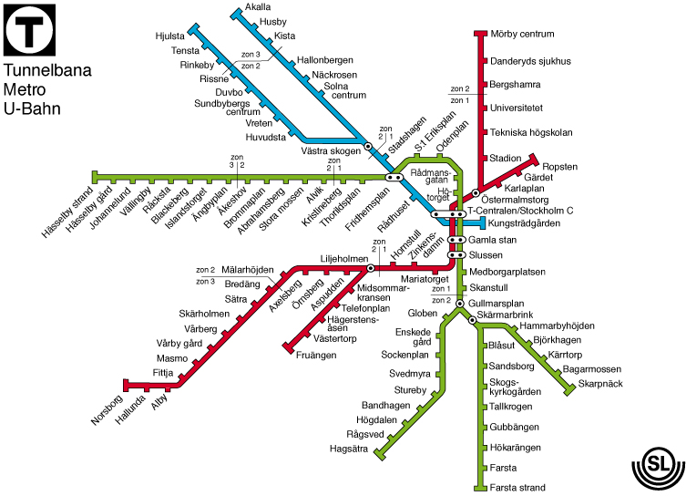
I think there is a compromise to be made. The best example of it I've found is the Stockholm metro map[1], which has straight, artificial lines but where the spacing and geometry between stations is still relatively faithful to reality. (Compare to what I assume is the real geography[2].)
Part of the problem is balancing all the factors - a "star" metro like Stockholm is much easier to map than one that has actual rings and loops and similar.
You could perhaps have thin lines between "walkable" stations for the cognoscendi or similar.
The station labels are at about the same angle as the perceptual cut-off of my astigmatism, so neither the usually-horizontal nor usually-vertical pers of the letters are in focus. The spaciousness and directionality of the map are nice, but it’s much harder than the all-horizontal London map.
(TBF I live in London so I’m fairly comfortable with the Tube map)
The Tube map is roughly geographic. Amersham really is North West of London. Waterloo really is South of the river. It doesn't try to preserve the geographic integrity you'd need for say, a walking map but it also isn't willing to just put a station where it would fit best aesthetically despite being completely wrong for geography.
It’s not an aesthetic decision, it’s a practical one juggling space constraints and clarity.
Where I live we have both: the main maps are non-geographic, and that allows them to be placed in several locations including the trains themselves. Geographic maps do exist, but take so much space they are only displayed at certain points in certain stations.
It is useful for the geography to be at least close-to-correct, because step 1 of navigating a transit map is deciding if transit is the best way to go. The tube map is well known for having spots that make this deceptive, e.g. tourists would take the tube from Bank to Mansion House, although it would often be faster to walk.
> It is useful for the geography to be at least close-to-correct
I agree. I don’t think the point in the documentary was that geography in subway maps is irrelevant, just that it is secondary to connection clarity. When in doubt, prioritise for the latter.
Additionally, I remember they made this comment specifically about the London Underground map, it wasn’t a blanket statement for all subway maps.
This is far more difficult to follow than the normal one. Some lines, particularly London Overground on the North side of the city, are all over the place.
finding a high quality SVG version in 2006 before it got taken down was a point of some pride for me at the time. I probably have it laying around somewhere still..
I find london tube maps depressing. Having lived in a few modern cities, none of which have decent public transport, I envy the tube concept. It was implemented when such things were possible. Today, building even a short point-to-point overland rail link through a city regularly costs billions. Such a system as the london tube, built from scratch, would cost not just billions over a couple decades, but maybe a literal trillion over a century.
An underappreciated thing transport maps have to do: on arriving at a station I need to figure out what platform to get on my train at to go in the right direction. Simplified grid-oriented maps like the classic tube map help disambiguate northbound/southbound eastbound/westbound.
Unless the station wayfinding is all going to be relabeled hubwards/rimwards/turnwise/widdershins then this circularized map is just confusing.
Also, how do you make a circular tube map and not make the circle line into a circle?
I really like it. I am not sure if it's any easier or more difficult than the current map, and I was able to trace a route from Waterloo to Walthamstow Central easily.
Possibly because I grew up taking the tube at least once a week and became used to the original map, but this one was straightforward to follow. I find it much more aesthetically pleasing than the original.
I wouldn't use this or the original to plan any kind of walking around London. I'd use a real A-Z or whatever to do that.
Seems like an overlook, although the Express is a bit of an odd duck. Relatedly, TFL's pedantry about Underground vs other rail is driving me batty. No one cares about rail gauge when they travel. Calling the Elizabeth "Elizabeth line" is ugly, and signs in Heathrow pointing to the Underground when the Elizabeth is in another direction entirely are downright insane in a place full of tourists. It confuses me, a Londoner, those poor sods carrying heavy luggage through doomed corridors stand no chance.
This is like the Vignelli map for the NYC subway. It's been renowned for a while and efforts lobbying for it to be the official map are slowly working.
Personally, I find a lot of nuance can be lost when just blindly following a route that an app recommends to me. This is particularly true when there are emerging delays on the tube and you need to figure out an alternate route, the time it takes until your app realises it needs to give you a different route is very annoying and a map allowing you to quickly figure out a different journey is great.
I also find that apps have very different idea to me in terms of my willingness to walk instead of bus/tube especially during changes. For instance, it’s often easier to walk from Liverpool Street to Moorgate for the northern line (say if you’re going to London Bridge) than it is to tube it to Bank or Moorgate. Until fairly recently, apps always told you to take the tube. I think this only changed because Liverpool Street and Moorgate are now properly connected via Elizabeth line.
Also when lines share tracks, looking at a map can often show you that you can use a different, quieter line for most of your journey then change at the last minute. For instance, when travelling west on Hammersmith and City from the city, it’s often advisable to take the quieter Metropolitan line for a while then change to the H&C you need when the two lines diverge.
Obviously for most people this doesn’t matter, but I’d maintain that maps of all kinds provide a valuable understanding of the network and allow people to make smarter decisions.
Every time I take the subway or train I look at the physical maps in the cars. I can double-check the connections, plus periodically look at it to know how far away I am.
And if I’m in a foreign country, I don’t want to waste precious phone battery and data navigating some app which may or may not work correctly.
This map would be instantly improved by swapping out Gill Sans, which is only used due to tradition and matching the external signage. Its too wide, and has too much flourish to be useful on a map this data dense. Something a little more condensed and more geometric and less humanist would work so much better here.
I just watched videos of vigilantes fixing potholes and creating flyers for local businesses that look better (for free). any other similar stories of people taking matters into their own hands?
"The London Underground map is one of the most recognisable in the world"
Why? How is it more recognizable that, say, the Paris one? Or New York?
EDIT: Since there are down votes, I will clarify my question do that we do not jump into underground nationalism: I was looking for unique features that make it recognizable.
As I mentioned in a comment: the ~~Peru~~ (EDIT: Nepal) flag is unique, this recognizable for instance.
If the map was round then yes, it is recognizable. Does it have any such features?
Or is it just recognizable because London is well known, so some stations are too?
EDIT 2: Please see PaulRobinson's answer for details
The "classic" Harry Beck London tube map is widely considered by design experts to be a masterpiece of map design, and it appears in design contexts, not just in the context of a map on the tube.
Over time this has caused TfL to attract people interested in designing for users of public transport, and they created a design system that is now licensed, and they do consultancy, so you will see "TfL style" design in other cities. The tube "roundel", map and advertising poster archive is all considered key commercial IP assets.
Many other public transport entities try to mimic TfL as a result, either by licensing directly (Dublin buses do this IIRC), or trying to look a bit similarly abstract and "clean" but with their own vibe. Weirdly this just makes the TfL design system even more recognisable to some people.
Another transport related design system from the UK that's worth looking into if you are interested in such things is the road signage system that was overhauled in the 1960s. It also highly regarded in the international design community: https://www.bbc.co.uk/news/magazine-15990443
Thank you for the answer (that is not a semantic discussion /end-of-rant)
I had no idea that the London map inspired so many others (among them - the Paris one I mentioned in my question), I thought that the design was rather a typical one for maps of underground services the same way as ground maps look more or less the same (at lest in their raw design). TIL.
It is "one of the most recognisable". That statement does not define which underground maps are the most recognisable in the world, just that London is one of them, which is undoubtedly correct.
Since there are down votes, I will clarify my question do that we do not jump into underground nationalism: I was looking for unique features that make it recognizable.
As I mentioned in a comment: the Peru flag is unique, this recognizable for instance.
If the map was round then yes, it is recognizable. Does it have any such features?
Or is it just recognizable because London is well known, so some stations are too?
All maps have problems with representing distance and space in a 2D form, but this become a little absurd. As an artistic experiment I'd give him a pass except he explicitly said:
"Let's get the geography as well because, with maps, shapes and geography are important. Let's try to make my map better than TfL in every way".
He then absolutely butchers the geography in terms of relative or absolute position, changes the shape of the Thames in weird and unfamiliar ways and makes it hard to reason about distances in many cases (Note: don't try and walk from Richmond to East Putney, as it's a lot further than it looks on that map: about half the distance (4.9mi) from Richmond to Farringdon (10.3mi).
I understand why maps get redesigned into different forms, and generally I love it if you're communicating a new idea about distance, space, or some other data point. But I don't really get what the idea behind this is other than "circles".