Hacker Newsnew | past | comments | ask | show | jobs | submitlogin

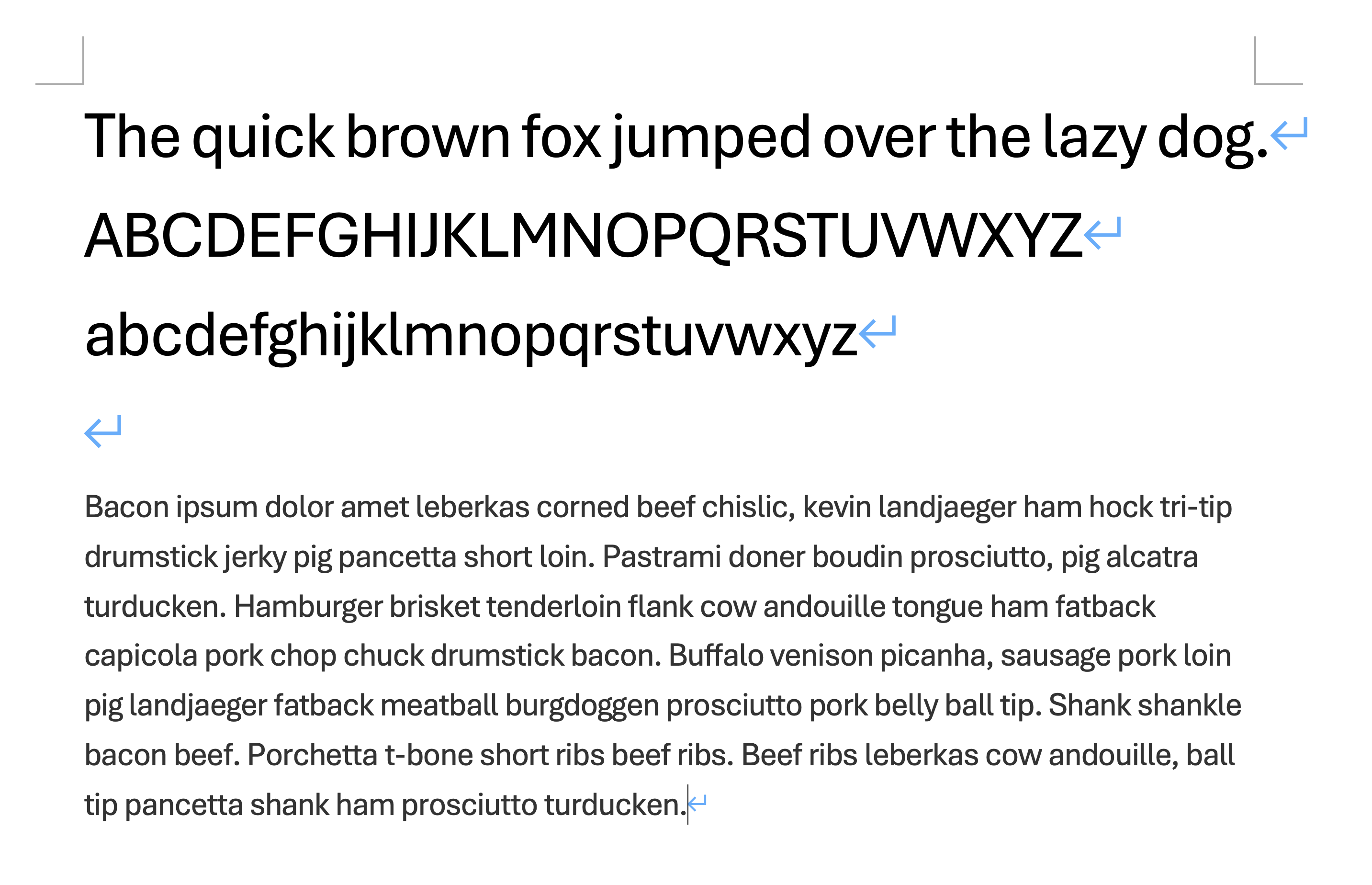
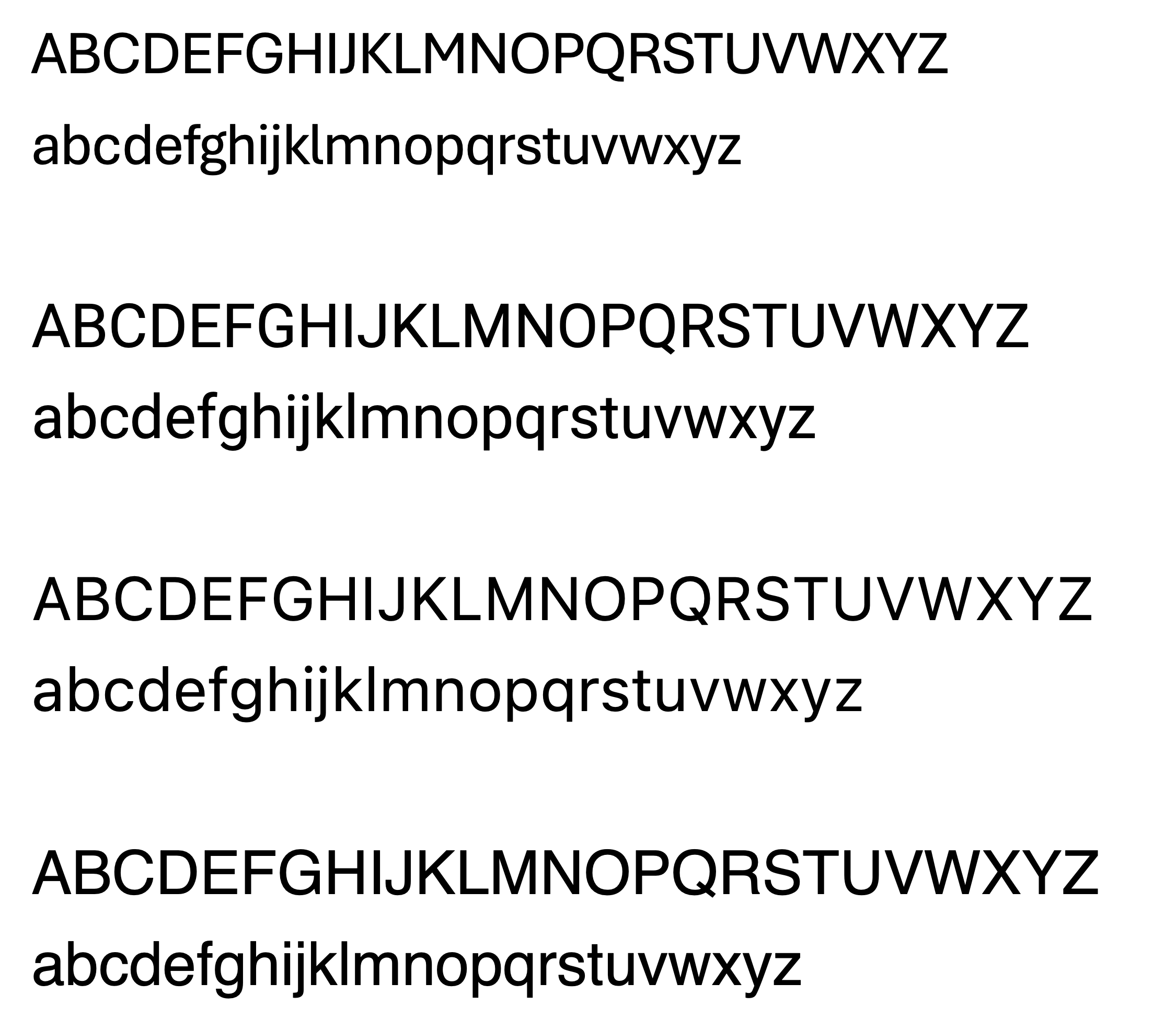
Is there a link to the font displayed in a longer example? I found the inline images both incomplete examples and hard to read with poor contrast. And even the paragraph about the double stacked g was next to an image without a g.

It looks like it could be a really nice font but it isn’t displayed well to show off!


Here's what it looks like in Word for Mac for me https://kalleboo.com/linked/aptos.png

edit: and vs some other fonts https://kalleboo.com/linked/aptos-roboto-sf-helvetica.png


That's a meaty lorem ipsum you've got there


At some point I started using https://baconipsum.com just for some variation


Thank you for doing what Microsoft, or really all those news outfits reporting on this, should have done!

So interesting to me that they kept the kerning of Aptos so tight. At least it looks like a modern, good font.

That said, Helvetica FTW (although I might actually like SF the most; certainly the most legible).


I see only two differences: J is narrower and l has a curved tail, which is good, less chance to confuse it with 1 or I.


what font size are you using for the four font comparison?


I think it was point size 24 but with some arbitrary view zoom to fill my screen more


Guidelines | FAQ | Lists | API | Security | Legal | Apply to YC | Contact

Search: