Lateness to market and image of Microsoft are thoroughly valid points, much like the reasons WebOS never worked out for Palm. There is a broader reason though:
Metro is a bad UI. It looks impressive in screenshots, but its usability is dismal. It relies too much on trying to guide the customer and be exciting rather and too little on creating a sensible and memorable logic that the user can intuit.
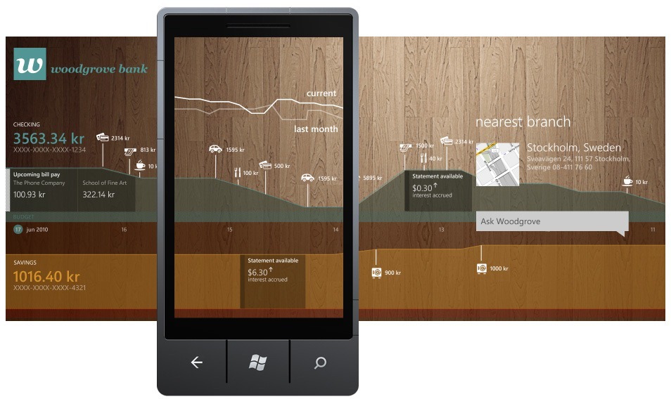
The implementation on WP7 is bad, all squished and uni-coloured (and on Xbox it's even worse). It does not bode well at all for Microsoft that they can't seem to remember that software is supposed to be used. It's like they've only learned the lesson of typography from Apple, and not the elegance of actual use.
Can you clarify what you mean by any of that with examples? Because I've enjoyed the Metro UI every time I've used it, and so has every reviewer I've seen. I guess we are all weird?
Sorry, have to disagree about Metro. Are you talking from experience with using WP7? Almost every review has only good things to say about Metro. When even Gruber(who jumps on every opportunity to diss non-Apple platforms) praises it, you know it's good.
And what about it being uni-coloured? Much of Metro is extremely colorful, including the tiles.
Yeah, dunno. I've seen the reviews and so on, but having played with metro on some devices, admittedly just in a store for maybe 10 minutes a few times, I just don't like it. The large text that just kind of runs off the side of the screen, and content hanging off just at the right edge to scroll to feels sloppy somehow. Also, I find the up transition jarring (kind of a page flip thing). The live tiles are sort of neat, but overall I don't care for the design aesthetic.
This is totally subjective, and probably just inertia w.r.t. what I'm already used to, but I just don't care for it, no matter how well reviewed it is.
Metro is a bad UI. It looks impressive in screenshots, but its usability is dismal. It relies too much on trying to guide the customer and be exciting rather and too little on creating a sensible and memorable logic that the user can intuit.
The implementation on WP7 is bad, all squished and uni-coloured (and on Xbox it's even worse). It does not bode well at all for Microsoft that they can't seem to remember that software is supposed to be used. It's like they've only learned the lesson of typography from Apple, and not the elegance of actual use.