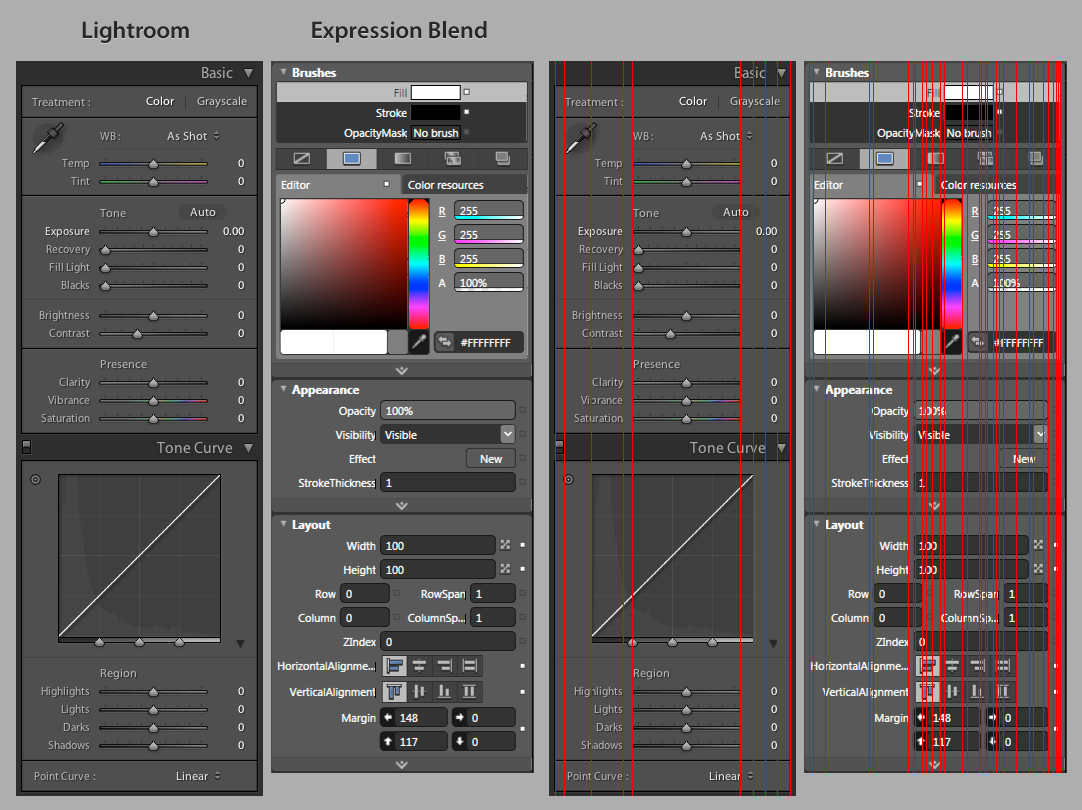
Alignment is everywhere. When you start analyzing interfaces you will often find that great interface design attempts to have as few alignment lines as possible.
Obviously text on a line is alignment too (horisontal).
And then there is optical alignment which is especially important in typography.
You want to have as few alignment lines as possible? I would think that aligning elements (buttons, form fields, etc.) would be a good thing. Of course, I'm a developer so that may be my problem. :)
That's a very powerful example. The Expression Blend interface (though it's showing a completely different function) feels very uncomfortable, while the Lightroom interface feels natural inviting. I'm glad to have learned that alignment lines make up a big part of that difference (I also prefer the Lightroom typography).
I am working on a small book about design for developers. Alignment is one of those things that people often don't really understand (besides left, center and right). Perhaps I should make that section a little bigger.
Please please let me know when you have this finished. Teaching developers about design is one of the big things that I try to do at my job, and I'm hoping to create some more formalized training in the near future.
And yes, alignment is a big deal, especially in any kind of information design. Look at magazines, newspapers, good newsletters, business cards, etc. Alignment is all over the place, and most are designed on a fairly strict grid, i.e. many newspapers use a 6 or 12 column grid.
The big concepts I want developers understand are: Alignment, repetition, contrast and proximity. If you understand those, you will be a better visual designer.
I've always aligned my UI designs on a grid, trying to promote order and minimize clutter, but I think having an articulated goal of minimizing alignment lines will help me in the future. I'll try to keep an eye out for your book.
P.S. "natural inviting" in my original post should be "natural and inviting".
If all of your buttons are aligned to one line, that's better than having half aligned to one line and the other half aligned to a different line. If none of your buttons are aligned, then you don't have zero alignment lines, you have as many alignment lines as you have buttons.
http://www.000fff.org/uploads/code_alignment.png
Alignment is everywhere. When you start analyzing interfaces you will often find that great interface design attempts to have as few alignment lines as possible.
Obviously text on a line is alignment too (horisontal).
And then there is optical alignment which is especially important in typography.