There was a whole research project at Stanford (Rivet - https://graphics.stanford.edu/projects/rivet/) which combined visualizations of code and hardware during execution and was able to keep history (here's an example where they were looking at memory stall issues -https://graphics.stanford.edu/projects/rivet/images/mview.gi...). And importantly, all the data and views were linked - for example, selecting a region of time when the CPU was stalled for memory would highlight the particular code in the source view that was currently executing. The system was used to analyze mobile networks, memory profiling, superscalar processors, and even debug the design of a GPU.
As an aside, a subsequent project in the lab called Polaris, built on the same system, became the precursor to Tableau (a business intelligence tool).
The power of visualization is that it can take abstract data and map it to visual features that our visual system can make sense of automatically without much cognitive load. An example I often like to give - imagine you were searching through my comment to count the number of 'e' letters. You would have to perform a linear scan. But now imagine the 'e's were red. You would almost instantaneously be able to jump from 'e' to 'e' and count them.
Fantastic set of info thanks! I especially love the linking idea; I think it's key to understanding things from multiple perspectives, especially if you're the only one/one of a few working on something.
Yeah quick visual decoding definitely needs to be the point of any visualisation. Its core intent should be to impart clarity, particularly when it comes to large datasets, because unlike machines we just can't process a lot of data in its raw form.
Sadly, many visualisations seem to miss this and sometimes even further complicate things.
Yes, exactly, the linking is really important. You can think of visualization as a mapping from an arbitrary space representing data to a 1d or 2D space representing pixel or image coordinates. That's what most charting software can do easily. However, the reverse transform is as important for interaction, and enables the user to work with the data instead of pixels on the screen. It's similar to Bret Victor's ideas around interacting with live code - without the inverse transform this becomes very difficult, as the user then has to compute it mentally - either by looking at the axes and legends in the case of charts, or the source code/variable viewer/stack view in e case of code, before going back to the original data.
While contextual information is also important, a lot of different abstract data types can be mapped to a fairly basic set of chart types (bar graphs, line charts, and scatter plots can handle most categorical/numerical/temporal combinations). For example, in the memory stall example above, there are only 2 types of visualization - bar charts and the source code views, yet in combination they provide various projections of a 5 dimensional space ('code position' x 'memory address' x 'processor' x 'metric[memory stall time]' x 'time'). The main issue is there is no easy tool to quickly construct/deconstruct multiple different projections of a high-dimensional space with linkage between them (here's a 2007 survey - http://www-devel.cs.ubc.ca/~tmm/courses/533-11/readings/cmvs...)
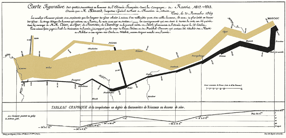
Definitely interesting. The best visualisations can encode information in multiple dimensions though, often as high as 5 or 6 (Minard's graphic of the march of Napolean is probably the most well-known example, encoding data in about 5 dimensions I think: https://images.thoughtbot.com/analyzing-minards-visualizatio...)
That linking logic is an interesting point though... you almost need a Flow-like system that can link the data display of one visualisation to another (or all the others). A tool like that would be very useful.
Well, Minard's graphic is actually 2 charts - the top one maps distance/abstract geography (2 dimensions), size of the army, and time/direction of movement. The bottom one maps the temperature to time during Napolean's retreat. It's tough to encode more than 3 separate dimensions on a chart (usually 2 spatial axes and a color/shape/size axis) and have it still be useful for analysis/presentation.
As an aside, a subsequent project in the lab called Polaris, built on the same system, became the precursor to Tableau (a business intelligence tool).
The power of visualization is that it can take abstract data and map it to visual features that our visual system can make sense of automatically without much cognitive load. An example I often like to give - imagine you were searching through my comment to count the number of 'e' letters. You would have to perform a linear scan. But now imagine the 'e's were red. You would almost instantaneously be able to jump from 'e' to 'e' and count them.